


In 2020, our digital product designers set out to create UI screens for their very own app concepts. The twist? They all delivered their designs in one 7-hour workday. The events of the challenge were hectic, but the genius and creativity were abundant. Thus, we’ve made it an annual thing!
In 2021, the Crema Design Challenge was fairly open concept. The team could design any kind of application they believed would benefit users in their daily lives. After spending the day ideating and executing, we hosted a live stream to showcase the final results. Take a peek at their screens below.
TBD
Product designer: Aubrey Schmidt

What was the concept behind TBD?
TBD is a problem-solving app for indecisive people. The idea was born from my husband and I’s movie jar. We pull ideas from it whenever we can’t decide on a movie to watch. We each placed 25 movie titles in the jar, and if we can’t agree on something, we watch whatever we pull out. From that, TBD came to life.
Within TBD, users can create jars for long-term decisions and hats for the short-term that they can use for any category to help them decide. There are all kinds of possibilities and scenarios for which TBD can be used, but at its core, it helps people save time.
What did you not get to that you hoped you could have?
I wanted to finish out the entire flow for what it would have looked like to actually pull an option out of one of the jars, or to highlight a hat draw. If I had more time, I’d finish out that last flow and ensure that I had everything covered, without making it too complex.
What was the most difficult part of the challenge?
For me, it was coming up with the idea. I always think of things that are too complicated, and I needed to think of something that was more simple. I saw our jar sitting in front of me, and then it came to me. It wasn’t a complex concept, but it made a lot of sense.
What was the biggest difference from last year’s challenge?
Last year, I made the mistake of going with a desktop app. I wasn’t able to get into the details as much as I wanted to. Doing a mobile app allowed me to get a lot more done than I felt I was able to last year.
Place
Product designer: Chris Cantrell
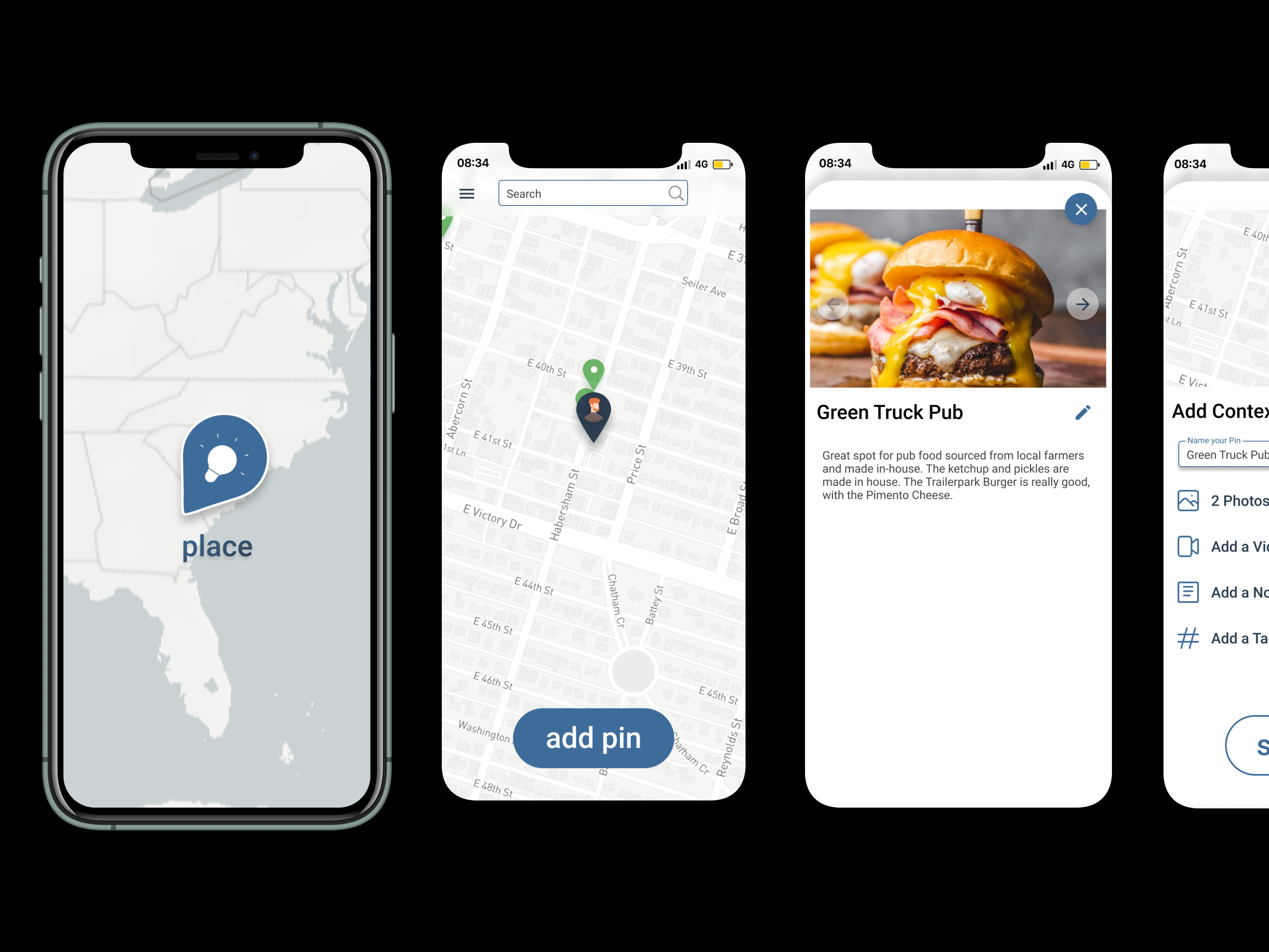
What was the concept behind Place?
I can’t remember the names of places. It’s always location-based for me. What if there were a way to log and track things that are personal to you based on geo-location? Place is an application that allows you to pin places that stand out to you on a map in your phone while adding a few extra details to make it more personal.
Once you’ve been somewhere and want to remember it on your map, you can drop a pin, add some photos, videos, notes, and tags to help you remember what made it stand out! Users can choose to make their pins public or private, allowing the opportunity for those who want to share their information with others.
What was the most difficult part of the challenge?
I would say the hardest part was getting everything lined up and making it work within the time frame. It feels like a given, as the time constraints are the main point of this design challenge, but I was still surprised at how difficult it was for me when I actually got down to it.
What did you not get to that you hoped you could have?
I would have loved to have expanded a few of the flows - adding tags and being able to highlight the differences between public and private usage on the app. Showcasing the public pins and how they can be used would’ve been something I would have liked to get to.
Peddle
Product designer: Mary Carnes

What was the concept behind Peddle?
Peddle was inspired by my move from KC to NYC, as I had to essentially furnish an apartment from nothing. I typically use Facebook Marketplace, but I’ve found many people my age either don’t use Facebook or use it for the bare minimum, and not with the intent to purchase. There’s a need for more digital marketplaces that are easy to use.
When you enter the app, you will see a customized “for you page” that shows furniture and brands the app believes you would like based on habits and preferences. The app also features a “pick-up now” capability that allows for quicker access to your products.
Other features include the ability to sort products by a specific seller on the app if you like buying from one particular person as well as a star rating similar to Uber drivers are rated by customers to ensure legitimacy amongst sellers and to provide feelings of safety for the exchange.
What was the most difficult part of the challenge?
I really struggled with getting too nitty-gritty on some stuff that was pretty basic and simple. I wish I had set aside some stuff that I didn’t need to spend as much time thinking about and that I could have come back to later.
What did you not get to that you hoped you could have?
I was hoping to investigate a little bit more about the purchase process behind existing digital marketplaces. Looking into a flow that makes the final purchase decision easier for users is something I think is very important, but I couldn’t get to it today.
What was the biggest difference from last year’s challenge?
The cleanliness. I went back and looked through my design challenge file from last year, and it was so messy and inefficient. I think I could have made more improvements faster last year if I had been using components properly. I was able to get things out much faster this year.
Ponder
Product designer: Steph Spicer

What was the concept behind Ponder?
I wanted to make a “question of the day” type app that blends with social media by encouraging collaboration and open conversation. Questions are posted out publicly, but when users respond to the questions, those responses are sent directly to the original poster to help start a personal conversation. Through direct messaging, the poster and responder can start a dialogue and continue the chat beyond the typical social media comment responses. Responses can be phrased as lists, pictures, standard text, and more.
What was the most difficult part of the challenge?
There were two aspects for me. Coming up with the idea was the first challenge, and then deciding what specific areas to focus on once I had my idea. Once the idea comes together, there are many ways to execute it. Determining which pieces to keep, which to get rid of, and which to spend more time on became a difficult task during the day.
What did you not get to that you hoped you could have?
I was only able to design the UI for typing out answers to questions and would’ve liked to have gotten to that with the other forms of answers (lists, pictures, etc.) I also wanted to build out more of what it would look like to review all of your personal questions and responses. That way users could have a record instead of having to search for each one individually.
Wander
Product designer: Sean Connolly

What was the concept behind Wander?
Wander is a walk-generating app that introduces walkers to new routes to explore in their neighborhoods and communities. Similar to Place, the app utilizes digital map capabilities to coordinate walking paths for users who are hoping to find new areas to walk around.
The app helps you determine your daily path by setting up a route criterion that covers the distance, style, sights, and elevation of the path you wish to take. Wander also utilizes notable places along the path to help you identify sights to see and places to stop during your walk.
What did you not get to that you hoped you could have?
I would’ve liked to spend more time focusing on and thinking about the ability to save and favorite walks. There are a lot of options for personalized features to make the app experience better for users and I wanted to explore those a little more.
What was the most difficult part of the challenge?
I didn’t feel incredibly prepared for this year’s challenge, and that was difficult for me. I probably could have stayed up later the night before spending more time envisioning what this could look like, and I didn’t. That ultimately made coming up with the concept tougher, as it felt like more of a rush to complete it without that preliminary direction.
What was the biggest difference from last year’s challenge?
I feel like I know Figma better now. I was able to use the tool more as it’s meant to be used, which helped me in the process.


