


Graphs can be an interesting and often complex design challenge for UI designers. These tips and tricks will help make designing graphs for your projects a breeze. What client doesn’t love a gorgeous dashboard filled with epic graphs in their web or mobile app? I’ve been developing some custom graphs for use in cyber-security and on-demand platforms for a while now, and here’s a few things I’ve learned. Graphs can be an interesting and often complex design challenge for UI designers.
Fortunately, there are plenty of plugins and assets available for us to pull from. Bar graphs and pie charts are easy enough, but when you start trying to represent real data, things can get tricky. For instance, there’s a big difference between saying this chart component represents 22% of some measure and actually designing it to be 22% of the whole component.
The percentage circle is a great example.I’ve witnessed several strategies for creating this, from masks to vector shapes that hide part of the circle. However, these make updating cumbersome and add more complication when there are several to show. Luckily, I found a super simple example online and never looked back. Percentage circles are now a breeze to make. Let me show you how.
Step 1: Make your circle
Start by making your circle. Be sure to note the size, as that comes into play on the next step. Rounding to a simple size will make this easier. For this example I’m using 100px. You’ll want to make a border and choose a color for your circle. I’m using the blue provided in Sketch’s default colors with a border of 5px. Finally, remove the fill because you won’t need it.
Step 2: Calculate your percentage
As noted, we’re using a 100px circle. To turn this into a percentage, we’ll need to do a little math. Hooray! To calculate the percentage we’ll need to know the circle’s circumference, i.e. the distance around the outside. This is where the 100px makes it easy. We’ll just be taking the size (diameter) of our circle multiplied times π (pi, or 3.14). For those doing the math along at home, that’s 314 pixels to equal our circle’s circumference.
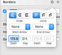
Now, how do we use that number (314) to display our circle as a percentage? This is where the beauty of Sketch comes in. Click the gear icon on the border option for your circle. Sketch allows you to do math inside any of its input fields, which is awesome. In the gap input, just take π*width, or 3.14*100, which equals 314. This will all but hide your circle. We’ll call this 1%.
Now whatever you enter into the dash input will slowly fill the circle up to the circumference value: 314px. Let Sketch do the math for you! Let’s say you want 56% filled. In the dash input, type out 314*.56 which will equal 175.84. That’s your percentage. Keep in mind: If you resize your circle, your percentages will be off. To avoid this, use the scale tool. You can input a specific height, width, or percentage to scale the circle proportionally.

Step 3: Rotate and label
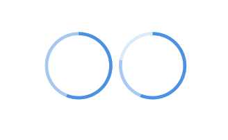
There’s only one flaw to this process: Sketch begins their gap/dash from the bottom of the circle. Why? It’s a mystery. And since most percentage circles go clockwise, this just won’t do. So should we rotate it 180º? It would move counter-clockwise. What if we flip it horizontally after that? That works, and is what I did for awhile, but it eventually got out of hand. The simplest process is just to flip it vertically.

Now that our circle rotates clockwise, we can have some fun. A simple label can denote the percentage.

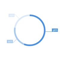
Or you can layer a couple of them to denote several percentages.
Or show it as a percentage of a whole.

The options really are endless once you master the basics.
PRO TIP: To find the percentage of an already existing circle, just reverse the process. Take the value of the dash input and divide it by the value of the gap input. In this example it would be 175.84/314 which equals 0.56, or 56%. Ta da!
To make a pie chart using this method, just set your border to inside position and increase the thickness until it is filled. Making the border too wide will cause the design to break on the inside, though, so watch that. The ratio between radius (width of the circle) and border seems to be 2:1, so a 100px circle will need a circle with borders of 50px.
If you need to do more complicated circles and find the percentage of a whole value you can do all of that in the inputs as well. Let’s say your percentage is based on a 0–5 grading scale, and you need to represent a circle that is 1.8/5. You could find the percentage first, then do the math, but this can consume time jumping between your calculator and Sketch. Use the input field instead. In the dash input, you’ll just type 314*(1.8/5), and your circle will be automatically set to the right amount.
Of course, you can always just fake some data and eyeball rough amounts until it appears representative, but the value of real data-driven design is it informs the user, or in some cases, the client. Real data gives a mockup life that fake data never can.
At Crema, we are beginning to use real data in more of our work. We’re using Sketch plugins to help streamline the process of gathering data from the client, implementing it into the design, and passing it off to the developers. Stay tuned for more demo articles like this!Thanks for reading! We like to write about our knowledge in the industry and what we’re learning along the way.
If you or your company is looking to build a product, at Crema are passionate about turning good ideas into great product experiences. Reach out to us!


