


Open a web browser and flip through a few of your favorite websites and web applications. What colors do you see? I'm going to guess anything other than white is reserved for buttons and branding. This is a perfectly sensible approach, but it can make the Internet a terrifically drab-looking place.
Of course there are strong arguments for limited color palettes in web and application design, especially when you want to bring impartial focus to the content itself. However, there's no crime in giving people an option to spice things up on your website or web app, and letting people choose a color theme is a great way to do that.
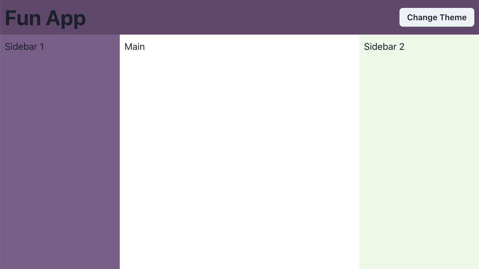
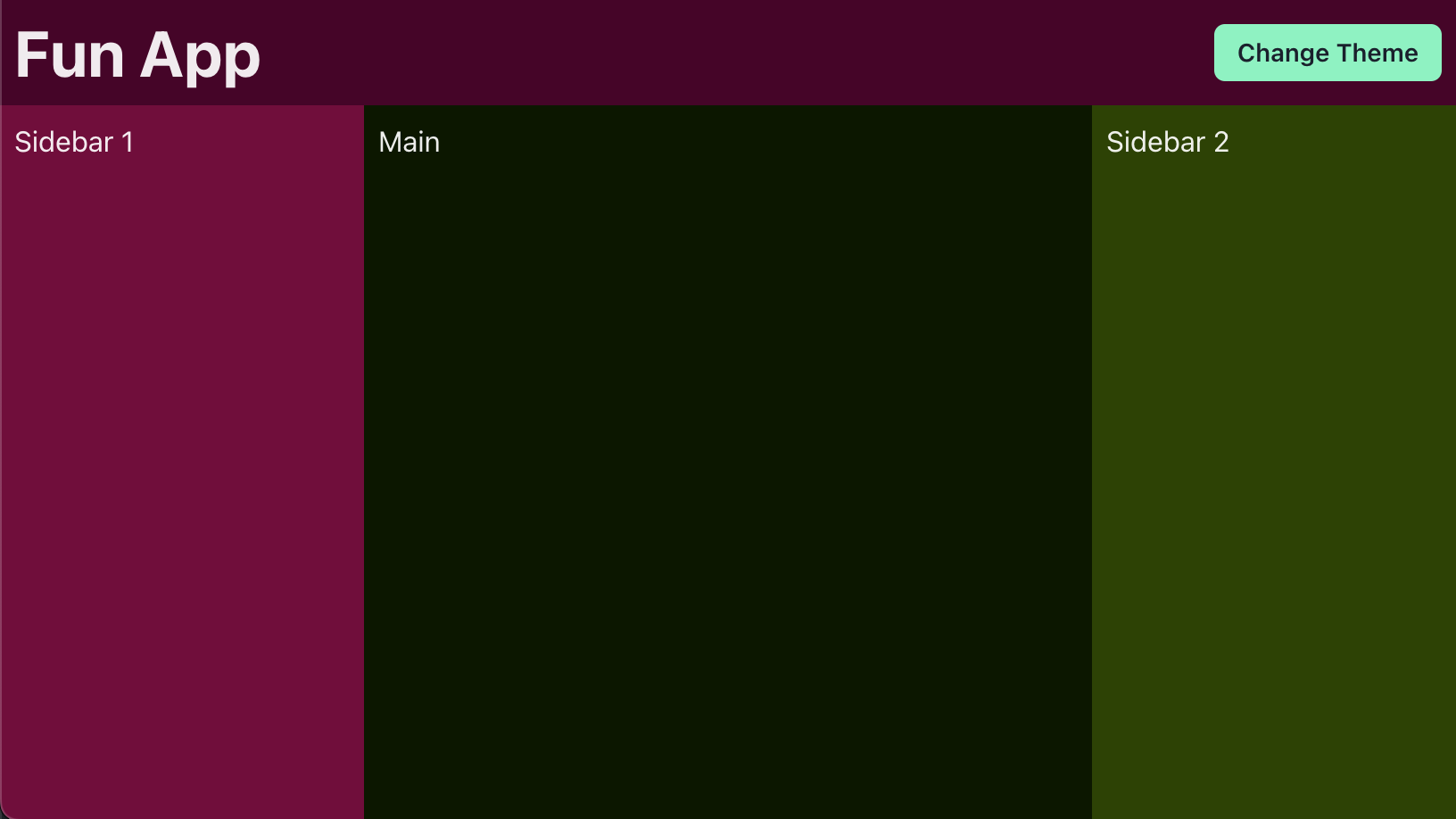
Let's dive into how you can brighten UX by generating a slew of color theme variations (a la Slack) to visitors, giving them the ability to instantly switch between them. For the sake of this article we've got a boilerplate app layout with two sidebars, a header, and a main section. We're going to set up a system to paint these components in (debatably) pleasant palettes.

Application setup
Chakra UI is a fantastic component library with a great built-in styled system and customizable theming. There are tons of other styled systems and component libraries for React that can accomplish what we're diving into here, but we'll focus on Chakra because of its built-in support for tokens and dark mode.
First we'll define our App component and make sure it wraps its children with a ChakraProvider:
Creating color themes
Our themes will be based around three main colors that we'll call primary, secondary, and action. Take this "Grape" theme for example: our primary is a purple, secondary is a faint blue-green, and our action is a vibrant yellow-green. Let's create a grape.ts file for our theme, which will export an AppTheme:
Our AppTheme has a name and id, as well as a colors object with our named colors. We get the ColorHues type from Chakra, which represents a color at different tints. SmartSwatch is a great tool for generating these off of a base color. Now that we've got a palette of colors, let's integrate them into our Chakra theme.
With this, we have extended the default Chakra UI theme to add our "grape" colors. Next let's use them in our app by adding a bg (or background) prop to our GridItem layout elements, selecting appropriate tint values for each area. You'll want to play around with the color values until you find something that looks good. The author understands that these examples do not.
Abstracting colors with Semantic Tokens
This is all fine, but if you're like me you don't want to have to remember the tint values for these colors should you use them elsewhere. Thankfully, Chakra supports Semantic Tokens, which allow us to define tokens within the color theme namespace that can reference existing color values. Let's modify our theme.ts file to define tokens for our background colors. While were at it, let's use Chakra's withDefaultColorScheme style utility to have all of our buttons use our action color scheme by default.
Now we can update our App.tsx to use these new semantic tokens.
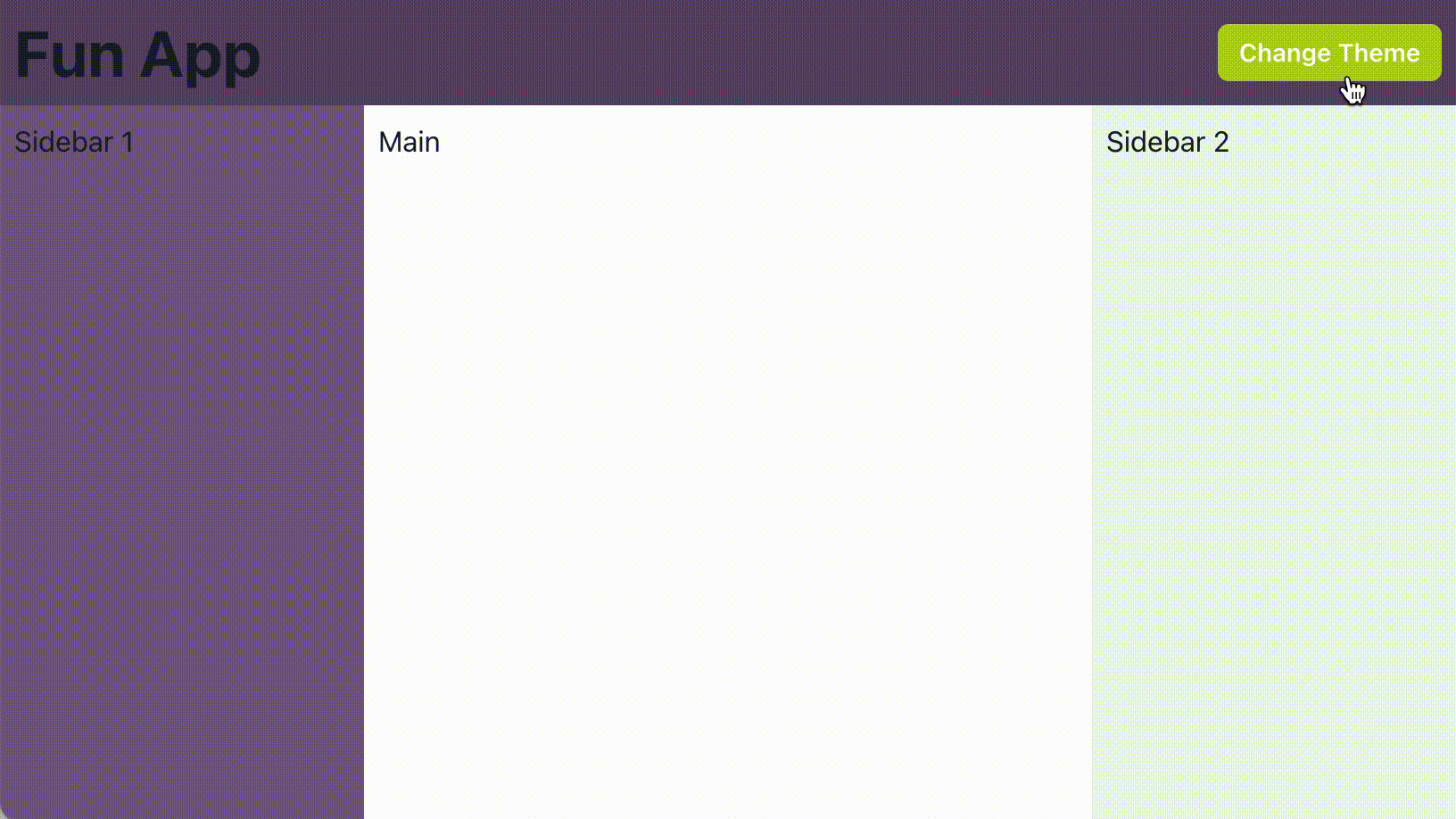
Great! We have abstracted specific tints of colors into named tokens that we can easily tweak from the theme file and implement anywhere else in our app. Working from the assumption that we've set up our app to support Color Mode, let's see how this looks when we switch to dark mode.
Dark mode
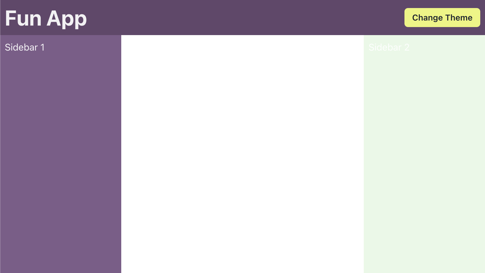
Since we've specified specific values for our background colors, they don't just magically get darker when dark mode is activated. Thankfully, semantic tokens can be conditionalized by using any of Chakra's psuedo-selectors. In our case, we'll use the default and _dark selectors to define the light and dark versions of each color.
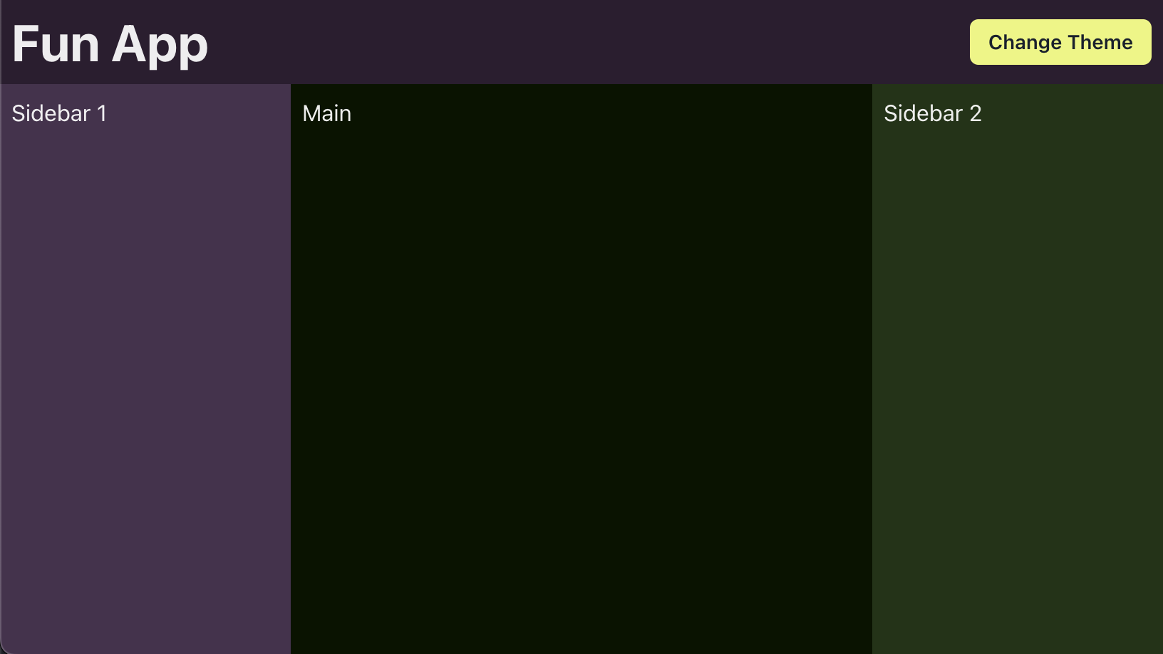
Much better! You'll of course want to tweak these values to suite your taste or design spec, but hopefully you can see how powerful color tokens can be in this context.
Additional color themes
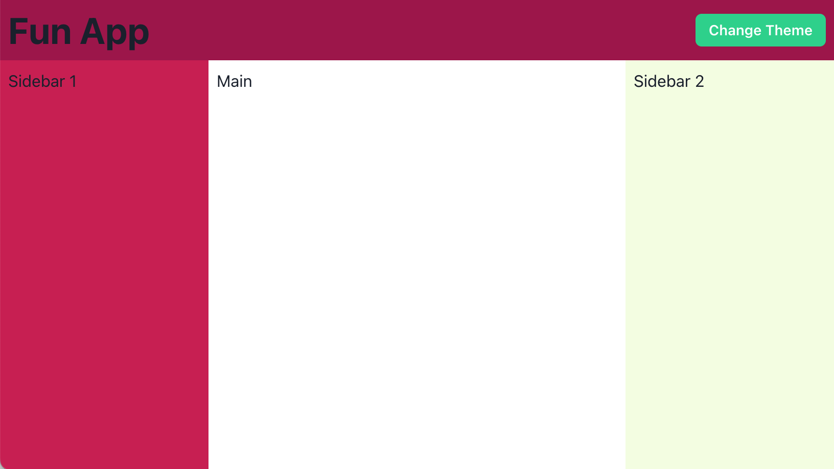
Why stop at just one theme? We've done the legwork of selecting background color values, so creating more themes should only be a matter of choosing different action, primary, and secondary colors. How about a watermelon theme?
Creating a color theme switcher
Now that we've got a couple semi-ugly themes to choose from, let's let people pick their poison. We'll implement a Popover on our "Change Theme" button that will list our available themes, and then use internal state to set an active color theme that gets merged into our base theme.
With this method, we get instant theme color changes for our app while satisfying Dark Mode die-hards. To create more color themes, all we need to do is choose more colors and create more theme files. We're only styling backgrounds here, but it's important to note that semantic color tokens can be used anywhere in Chakra's styled system. You can target text, buttons, or other custom components. If you need to apply your theme tokens to a component outside of Chakra's styled system, you can get any token value with Chakra's useToken hook.
Things to keep in mind
Accessibility
Even though you can get pretty wild with color theming, you should keep accessibility at the forefront and ensure you maintain a good color contrast ratio between background and text colors. Some of the above examples fail in this area, and if we were to use them, we'd want to explore making the text colors responsive to the backgrounds they're on. The WCAG Color Contrast Checker is a good tool to make sure you're in compliance.
SSR
Unless your application is going to store a user's color theme selection on the server and render pages upon request, the generated HTML/CSS is not going to take color theme preference into account. You should provide a sensible (read "boring") default color theme to use at build time.
Persisting preference
If you're giving people the ability to customize their experience, you should respect their choice by reflecting it on subsequent visits. You can save their selected color theme to SessionStorage or LocalStorage on the cheap, or persist it to a user's preferences on the server that's an option for you.
Taking it further
Perhaps it doesn't make sense for your application to veer too far from a newspaper in terms of its color palette. How else might you take advantage of semantic tokens and dynamic theming? Here are some ideas to explore:
- Allow your users to select different fonts and font sizes for better legibility
- Style your website based on a visitor's time of day (morning, afternoon, night)
- Customize the look of your application to reflect a user's favorite sports team
- Extract dominant colors from album artwork and style a music player to match
Now go forth and make the web more customizable (and fun)!


